

// visual identity
Brands we designed.
A logo isn’t decoration — it’s the shorthand for an entire brand. On every project we start from meaning and end with a mark that works at any scale. Here are a few projects and the path that led to them.
01 — SaaS · education & sport
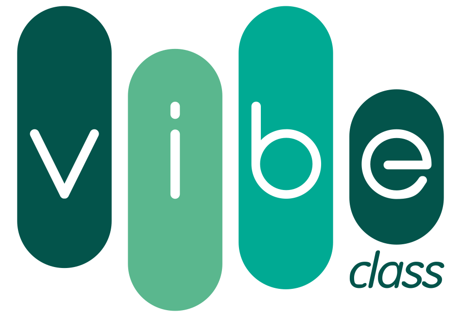
VibeClass
A management system for schools and studios. The brand had to feel friendly to owners, parents and instructors — while clearly reading as a “product”.
- Mark
- Four vertical “pills” (v-i-b-e) read like an equaliser and the rhythm of classes — movement, energy and a repeating schedule.
- Colour
- Greens from deep to emerald — growth, freshness and health, close to the world of sport and movement.
- Typography
- Soft, rounded letters and a handwritten “class” — warmth and approachability instead of corporate coldness.
- 01Brief: a friendly yet credible SaaS for these venues.
- 02Exploring the theme of movement and class rhythm.
- 03The equaliser-pill form + choosing the greens.
- 04Handwritten “class” suffix and final variants.

02 — Security · online defence
eobrona.pl
A brand in the protection and security space. The key was an immediate sense of trust and gravity right at the level of the mark.
- Mark
- An emblem built on the symbolism of a shield — protection, authority and readiness to act.
- Colour
- Gold (authority, prestige, justice) + red (alertness, alarm) + navy (gravity and professionalism).
- Typography
- A stable, legible wordmark — the foundation of credibility, with no embellishment.
- 01Brief: trust and a sense of protection.
- 02Directions based on a shield / emblem.
- 03An “authority + alarm” palette (gold, red, navy).
- 04Refining the crest and the horizontal version.

03 — Firearms & ammunition · militaria
elcolt.pl
A shop selling firearms, ammunition, accessories and tactical clothing. The mark had to stand out from typical military logos — to be simple, but with a strong, recognisable symbol.
- Mark
- We built the symbol from two letters of the name — “e” and “c”. The rotated “c” set against the “e” forms the silhouette of a handgun, and the circle closing them is a clear nod to defence. Instead of a literal drawing of a pistol — a shorthand hidden in the letters.
- Colour
- Monochrome black — a single colour that works equally well on the website, a label, a patch and gear.
- Typography
- Simple, geometric lowercase letters — no embellishment, so the symbol stays the hero.
- 01Premise: the mark should evoke a weapon, but not be literal.
- 02From the name we picked two letters — “e” and “c”.
- 03Rotating the “c” and pairing it with “e” gave a handgun silhouette.
- 04The circle closes the symbol and adds the sense of defence.
04 — Physiotherapy & rehabilitation
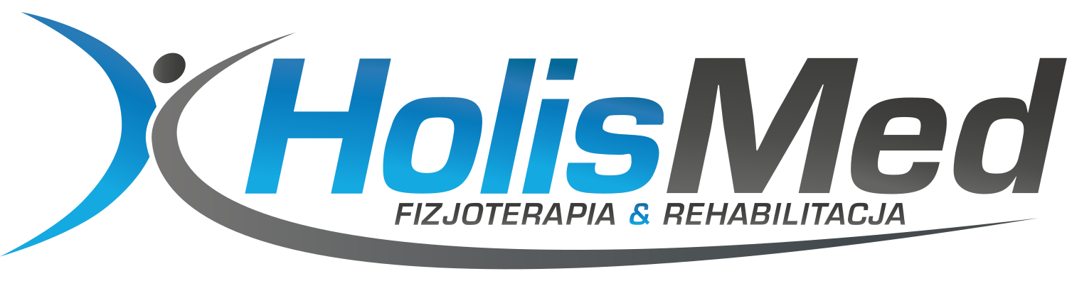
HolisMed
A physiotherapy and rehabilitation practice with a holistic approach to treatment — the patient treated as a whole, not symptom by symptom. That approach is written straight into the name.
- Mark
- The symbol is a figure of a person bursting with life. The wide range of motion shows full fitness — the outcome rehabilitation leads to.
- Colour
- The gradient reflects transformation — the patient’s path from limitation to fitness. Kept in a calm, muted tone.
- Typography
- Calm, legible typography — at home in a clinic, with no sales tone.
- 01Premise: physiotherapy and rehabilitation, a holistic approach.
- 02The symbol as a figure of a person in motion.
- 03A wide range of motion = full fitness.
- 04The gradient shows transformation — the result of therapy.